
Leave A Message
If you are interested in our products and want to know more details,please leave a message here,we will reply you as soon as we can.
Green to Grey Photochromic Pigment, UV Color Changing – KT-PMC-06-GG
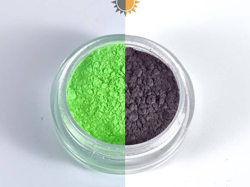
KT-PMC-06-GG is a Green/Grey photochromic pigment in the fine 1–10μm particle size range — a UV-reactive pigment that appears green under standard indoor lighting and shifts to grey when exposed to direct sunlight or UV irradiation.
Item No. :
KT-PMC-06-GGColor Effect :
Green/GreyParticle Size :
1–10 µmBrand :
Kolortek / OEMMOQ :
1KGApplication :
Printing Inks, Textiles, Toys & Novelty, Cosmetics, Packaging, Decorative Coatings, Plastics, Craft
Green to Grey Photochromic Pigment, UV Color Changing – KT-PMC-06-GG
Special Effect Pigments › Photochromic Pigment Series
KT-PMC-06-GG is a Green/Grey photochromic pigment in the fine 1–10μm particle size range — a UV-reactive pigment that appears green under standard indoor lighting and shifts to grey when exposed to direct sunlight or UV irradiation. Among the Kolortek photochromic range, KT-PMC-06-GG occupies a distinct design position: the green-to-grey transition is a cool, muted color shift — moving from a natural green tone toward a neutral grey rather than producing a dramatic high-chroma color change. This tonal character suits applications where a subtle, design-coherent UV response is preferred over maximum visual contrast.
The Kolortek photochromic range includes both high-contrast shifts (yellow/purple, green/red) and adjacent or tonal shifts. KT-PMC-06-GG is a tonal shift — green and grey share a cool, muted aesthetic, and the transition between them reads as a natural desaturation under UV rather than a stark color family change. For products positioned in outdoor, nature, or technical markets — apparel, sporting goods, functional accessories — this muted UV response fits product identity better than a highly saturated color shift would. The visual effect is still clearly perceptible, but it reads as sophisticated rather than novelty-forward.
| Parameter | Value / Notes |
|---|---|
| Item No. | KT-PMC-06-GG |
| UV-Off Color (indoors) | Green |
| UV-On Color (sunlight / UV) | Grey |
| Shift Character | Tonal / desaturating — cool-to-neutral shift; muted rather than high-contrast |
| Effect Type | Photochromic (UV-reactive) — requires UV/sunlight; inactive under standard indoor artificial lighting |
| Activation Trigger | Direct sunlight, UV lamp (~365nm) — NOT activated by standard LED, fluorescent, or incandescent indoor lighting |
| Activation Speed | ~1 second under direct sunlight to reach grey state |
| Reversion Speed | Seconds to minutes after UV removal — faster at higher ambient temperature |
| Particle Size | 1–10μm |
| Reversibility | Fully reversible — returns to green when UV is removed |
| UV Fatigue | Photochromic performance decreases with cumulative UV exposure — fatigue rate varies by binder, UV intensity, and temperature |
| Binder Compatibility | Water-based, solvent-based, UV-curable — confirm for specific systems |
| Documentation | TDS, SDS on request |
| Brand | Kolortek |
| Item No. | Indoor Color | UV Color | Contrast Type |
|---|---|---|---|
| KT-PMC-01-YG | Yellow | Green | Adjacent warm-to-cool |
| KT-PMC-02-YP | Yellow | Purple | High contrast — complementary |
| KT-PMC-03-PP | Pink | Purple | Adjacent pink to purple |
| KT-PMC-04-YR | Yellow | Red | High contrast — warm family |
| KT-PMC-05-BP | Blue | Purple | Adjacent cool-hue |
| KT-PMC-06-GG | Green | Grey | Tonal — cool-to-neutral desaturation |
| KT-PMC-07-GR | Green | Red | High contrast — complementary |
Single-color activated grades (colorless-to-color) are also available: KT-PMC-12-PA (Purple), KT-PMC-14-BA (Blue), KT-PMC-16-YA (Yellow), KT-PMC-17-OA (Orange), KT-PMC-19-RA (Red), KT-PMC-22-GA (Green), KT-PMC-29-SB (Sky Blue) — all at 1–10μm. Contact Kolortek for the complete photochromic range.
Green-to-grey — the only neutral-shift in the two-color photochromic range: Every other two-color photochromic grade in the Kolortek range shifts between two recognizable hue families. KT-PMC-06-GG is the exception — its UV-on state is grey, a neutral tone rather than a colored hue. This makes it the most tonally restrained option in the series. For products where the UV response needs to read as a technical or functional material behavior rather than as a novelty color effect, the green-to-grey shift provides a more understated expression of the photochromic function.
Both states are always visible — no substrate dependency: Like all two-color photochromic grades, KT-PMC-06-GG is visibly colored in both states — green indoors, grey outdoors. There is no colorless phase that requires a base coat reveal-layer design. This simplifies formulation compared to single-color activated grades (e.g., KT-PMC-22-GA, which is nearly colorless indoors and green in UV). For nail lacquer, coatings, and apparel applications, the green indoor color is a product feature in itself; the grey shift in sunlight is the UV-responsive overlay.
UV fatigue — the standard durability constraint for organic photochromic pigments: Organic photochromic molecules degrade with cumulative UV exposure, with switching efficiency and color depth in the activated state decreasing over time. For products with limited expected outdoor UV exposure — promotional items, seasonal accessories, nail lacquer with typical wear cycles — fatigue is unlikely to be a practical concern within the product lifecycle. For high-exposure outdoor applications — exterior coatings, performance apparel worn year-round — fatigue testing under your specific conditions establishes realistic service life expectations. Binder selection and UV management strategies affect fatigue rate significantly; contact Kolortek for guidance.
Kolortek has supplied photochromic pigments alongside its broader special effect pigment portfolio for over 20 years. The photochromic range covers 17 grades across single-color and two-color shift variants at 1–10μm, providing color matching flexibility for product development across the UV-reactive category. TDS and SDS are available on request for KT-PMC-06-GG.
| Application | How KT-PMC-06-GG Contributes | Notes |
|---|---|---|
| Nail lacquer | Green-to-grey UV-reactive nail color — green indoors, grey in direct sunlight | Muted shift suits sophisticated nail color positioning; verify cosmetic compliance in target market |
| Printing inks | UV-reactive green/grey in specialty screen and flexo inks for outdoor packaging and labels | 1–10μm suits most printing configurations; add at final low-shear stage only |
| Coatings & paints | Outdoor UV-reactive color shift in decorative coatings, technical surfaces, promotional paints | Fatigue test for cumulative outdoor UV load; protective binder extends service life |
| Textiles & apparel | Green-to-grey shift in outdoor performance apparel, accessories, sportswear | Tonal shift suits technical and outdoor brand aesthetics; evaluate fatigue for wash and UV exposure cycles |
| Plastics | UV-activated green/grey color change in outdoor plastic products and accessories | Confirm processing temperature; 1–10μm disperses well in masterbatch systems |
| Cosmetics | UV-reactive green eye shadow or body product that shifts to grey in direct sunlight | Verify cosmetic regulatory compliance and safety documentation for target market before specifying |
Q: Is the green-to-grey shift of KT-PMC-06-GG clearly visible, or too subtle to notice?
A: The shift is perceptibly distinct — green and grey are recognizably different colors, and the transition from a medium green to a neutral grey in direct sunlight reads clearly to the eye. However, compared to high-contrast shifts like yellow-to-purple (KT-PMC-02-YP) or green-to-red (KT-PMC-07-GR), the green-to-grey transition is more tonally restrained. Whether this suits your product brief depends on your design intent. Request samples of KT-PMC-06-GG and adjacent grades to evaluate the shift character directly before specifying.
Q: How does KT-PMC-06-GG differ from KT-PMC-07-GR (Green/Red) for outdoor applications?
A: Both grades are green indoors. Under UV, KT-PMC-07-GR shifts to a highly saturated red — a high-contrast, high-visibility change that works well for novelty products, promotional items, and applications where the UV response needs to be immediately obvious. KT-PMC-06-GG shifts to grey — a muted, neutral tone that reads as a desaturation of the green rather than a color family change. For technical, nature, or design-forward outdoor products where subtlety is appropriate, KT-PMC-06-GG is the more suitable specification. For maximum UV-response visibility, specify KT-PMC-07-GR.
Q: Does the grey UV-on state look the same on all substrates?
A: Because KT-PMC-06-GG is a two-color grade (visibly colored in both states), the grey UV-on state is generated by the pigment itself and is not dependent on a reveal-layer base coat. However, the perceived grey shade will be influenced by the substrate color and the total ink or coating film transparency. Over a white substrate, the grey reads as a neutral medium grey. Over a dark or colored base, the grey may appear darker or more muted. Evaluate the UV-on color appearance over your actual substrate before production specification.
Photochromic shift character is best assessed in person under your actual UV conditions — the green-to-grey tonal shift of KT-PMC-06-GG reads differently in direct outdoor sunlight versus a UV lamp, and in different binder systems. Contact Kolortek to request a sample of KT-PMC-06-GG alongside other photochromic grades for direct comparison, download the TDS, or discuss the full photochromic range.
Photochromic Pigments change color in response to UV light exposure, transitioning from a pale or near-colorless state indoors to a saturated color within seconds of UV exposure, then reversing when the UV source is removed. The KPMC series is available in multiple colors with a particle size of 1–10 µm, suitable for inks, coatings, plastics, and cosmetic formulations where a UV-activated color response is required.
Read More
KT-PMC-02-YP is a Yellow/Purple photochromic pigment in the fine 1–10μm particle size range — a UV-reactive organic pigment that appears pale yellow in the absence of UV light and shifts to a deep purple within approximately one second of exposure to direct sunlight or UV illumination.
Read More
KT-PMC-06-GG is a Green/Grey photochromic pigment in the fine 1–10μm particle size range — a UV-reactive pigment that appears green under standard indoor lighting and shifts to grey when exposed to direct sunlight or UV irradiation.
Read More
KT-PMC-14-BA is a Blue photochromic pigment in the fine 1–10μm particle size range — a UV-reactive single-color activated grade that appears pale or near-colorless under standard indoor lighting and shifts to a deep blue within approximately one second of exposure to direct sunlight or UV irradiation.
Read More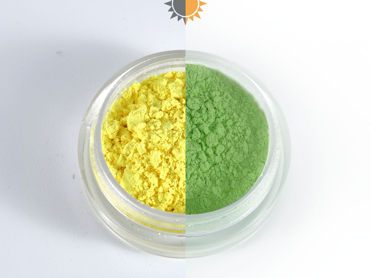
This photochromic pigment shifts from a pale or clear state to a deep, rich color within one second of direct sunlight, then reverses indoors. Fine particle sizing makes it a workable printing pigment for inks, screen printing, and surface effects, with both clear-to-color and color-to-color options across purple, blue, red, green, and more. As a UV activated pigment, it stays dormant until sunlight or UV hits the substrate — no external power, no coating, just light.
Read More
 English
 Français
 Deutsch
 Русский
 Español
 Português